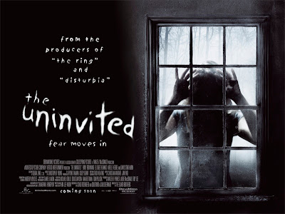
This thriller poster is clearly advertising the thriller genre by using dark colours and weird writing. The use of dark colours is showing the thriller genre were as if it was colourful it would not look so effect as the right genre. The fact of making a big section of the poster saying that it was made from the same director of the the ring and disturbed, which are both known for being respected horror films. The fact that no people are used in the poster but are blacked out just showing the body against a door.

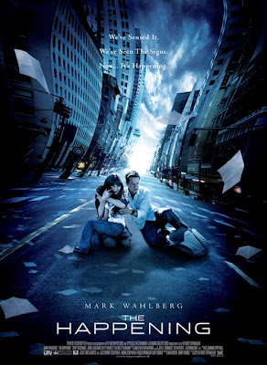
This poster uses a blue colour, which goes against the typical conventions of using dark colours. The main character who is a big Hollywood actor has his name in the poster above the film title.
The poster has the characters set in the middle of the street which looks like new york. The street they are on looks abandoned with paper blowing around the the characters curled up in the middle of the poster. The poster shows the thriller genre through the fact that the characters are alone and the street behind them is blurred and twisted.

No comments:
Post a Comment